Jewel Toned Interiors
Rebuilding the digital presence for a multidisciplinary interior design firm.
.png)
DELIVERY
services delivered for this project
Web Design
Web Dev
CMS
SEO
UX/UI
Challenge
Jewel Toned Interiors came to 9 Designs at a pivotal moment.
An established, women-owned design firm with 200+ completed environments and more than a million square feet of designed space, JTI had a strong reputation, a distinct creative point of view and ambitious plans for growth across workplace, wellness, luxury residential, hospitality and community projects.
But the website needed to work harder. It needed to carry the same standard as the studio's work: design as a functional discipline, not decoration. It needed to articulate the level JTI operates at, guide the right clients through the decision-making journey, and signal the calibre of work the studio takes on.
The website had to support the firm's wider ambition. It needed to:
- Present JTI as a high-level, strategic design studio spanning interiors, architecture and branding.
- Balance residential, commercial, wellness and hospitality audiences.
- Make the business feel premium without becoming cold or generic.
- Show the depth of thinking behind the work, not just finished visuals.
- Help qualify better enquiries.
- Communicate that JTI works with serious clients and meaningful budgets.
- Create a stronger platform for SEO, ads, future content and ongoing optimisation.
- Preserve the personality, warmth and confidence of Joy and the team.
This was not just a visual refresh. The website had to become a business tool.
There was also a deeper strategic problem that surfaced during the work, where clients often engaged JTI too late in the project lifecycle, after decisions had been made that the design process should have shaped. The website needed to teach prospective clients when to engage, not just why.
This project had to answer questions such as:
- Who is JTI best suited for?
- What kinds of projects should the website actively attract, and which should it gently repel?
- How should the site communicate minimum project value without feeling blunt?
- How should commercial, residential, wellness and hospitality pathways be structured?
- How do you migrate seven years of blog content and 45 projects without losing search equity?
- How much copy is enough to build trust without making the site feel heavy?
- How could the website support launch, SEO and paid acquisition afterwards?
- How could 9 Designs work as a strategic partner rather than a one-off supplier?
The answer was to treat the website as the centre of a wider growth system.
Pre-Work
Discovery and alignment sessions confirmed goals, audiences and conversion paths, with the commercial versus residential split established as the central structural decision. When initial proposals exceeded the available budget, we restructured the scope through tiered options rather than diluting the work, protecting every critical deliverable.
We also confronted the migration risk early. The existing WordPress site held roughly 225 blog posts across 25 archive pages and 45 project pages, seven years of accumulated search equity that could not be lost. We crawled the full archive, mapped every URL, flagged legacy slug problems and duplicates, and built a complete 301 redirect programme before the new site existed.
.png)
Strategic Approach
9 Designs approached the project by looking beyond pages and visuals, starting with the commercial role of the website: what it needed to say, which decisions it needed to support, and how it could help JTI grow with more intention.
The strategic direction focused on six ideas.
1. Positioning the studio at its true level
The site had to present JTI as a high-level, multidisciplinary design partner across interiors, architecture and branding, with design framed as a functional foundation rather than decoration. An editorial, luxury-calibre experience that shows the depth of thinking behind the work, not just finished visuals.
2. Editorial, premium and commercially clear
For a design studio, the temptation is to let imagery do everything. But imagery alone does not explain the value of the thinking, strategy and process behind the work. 9 Designs shaped the site to balance editorial presentation with clearer messaging, so visitors could understand not only what JTI creates, but why the studio is trusted to lead meaningful projects.
3. Clear audience pathways
JTI needed to speak to different client types without fragmenting the brand. The structure had to support commercial opportunities, private residential clients, wellness and community work and future hospitality ambitions, while still feeling like one coherent studio. Tone was tuned per audience down to the pronoun level: "your project" for commercial, "your home" for residential.
4. Proof at decision points
Case studies, project imagery, testimonials, press, awards, process content and service explanations all had to work together. The site was framed around trust-building moments: the points where a potential client is deciding whether JTI understands them, whether the studio is credible, and whether the next step is worth taking.
5. Intentional fit
Alongside attracting the right clients, the experience quietly communicates the level the studio works at, helping serious prospects recognise themselves and guiding every visitor towards the right conversation. Better-fit enquiries follow naturally from that clarity, without the site ever feeling like a gatekeeper.
6. A platform for ongoing growth
The relaunch was treated as the beginning of the next phase, not the end of the project. From the start, 9 Designs considered how the site would support ongoing marketing: website management, SEO articles, Google Ads, landing-page improvements, AI tool testing, tracking, conversion optimisation and strategic advisory.
Action Plan
The plan ran in four phases: discovery, UX strategy and wireframes; UI design and a full design system; development, CMS build and integrations; then QA, launch and handover with post-launch support. Threaded through all four was the migration programme, a bespoke component library that grew well beyond the original scope, and a technical SEO foundation built into the site rather than bolted on afterwards.
What made the plan work was the operating system built around it. A single living Project Master Doc became the shared source of truth for both teams, containing:
- A page-by-page copy and media schedule. Every page prioritised and sequenced, from Home at priority one through Expertise, all six project verticals, About, Contact and Press, so the client always knew exactly what to work on next and content arrived in build order rather than all at once.
- Copy and media guidelines. Practical rules that removed friction: write enough to fully explain and we will help cut and refine; hero images high-res and landscape; send detail shots too and we will find creative uses; minimum resolutions and formats specified so nothing arrived unusable.
- A shared task table. Every workstream split into "9 Designs to do" and "JTI to do", covering the review workflow, kickoff recap, priority plan, UX/UI phase, Webflow build, copy guidance, media collection and team photography, so ownership was never ambiguous.
- A curated design direction library. A reference set of interiors and architecture websites used to align visual taste early, so design decisions were made against shared examples rather than abstract descriptions.
- Structured wireframe feedback. Client questions and design feedback captured and resolved inline in the doc, question by question, so nothing was lost between calls.
Weekly check-ins, fast decisions over chat and formal approvals by email kept the whole thing moving as a partnership rather than a handoff.
Execution
We had 7 stage plan for the execution which followed:
Stage 1 - Discovery, UX strategy and structure
The engagement opened with discovery and alignment sessions to confirm goals, audiences and conversion paths, with the commercial versus residential split confirmed as the central structural decision.
9 Designs delivered:
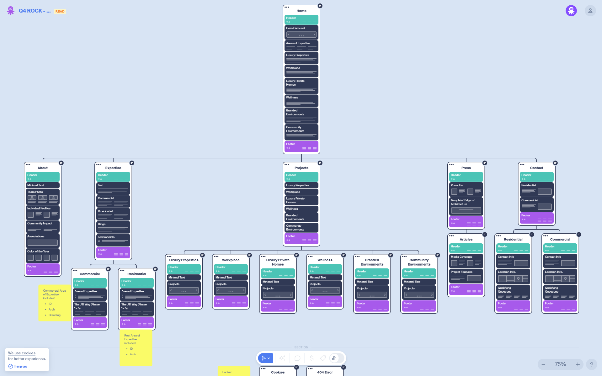
- Implemented sitemap and information architecture built around audience journeys rather than internal structure.
- UX strategy covering CTA placement, form friction reduction and mobile-first behaviour.
- Desktop and mobile wireframes for Home, About, Expertise, Projects listing and detail templates, Press, Contact, and Blog listing and post templates.
- Audience pathway planning across the six environment verticals: Workplace, Wellness, Luxury Properties, Luxury Private Homes, Branded Environments and Community Environments.
- Qualification thinking baked into the journey before a form is ever reached.

Stage 2 - UI design and the design system
The visual direction had to respect the nature of JTI's work: premium, spacious and visually led, while still usable, clear and structured. The goal was not to overpower JTI's portfolio. It was to give the work a stronger frame.
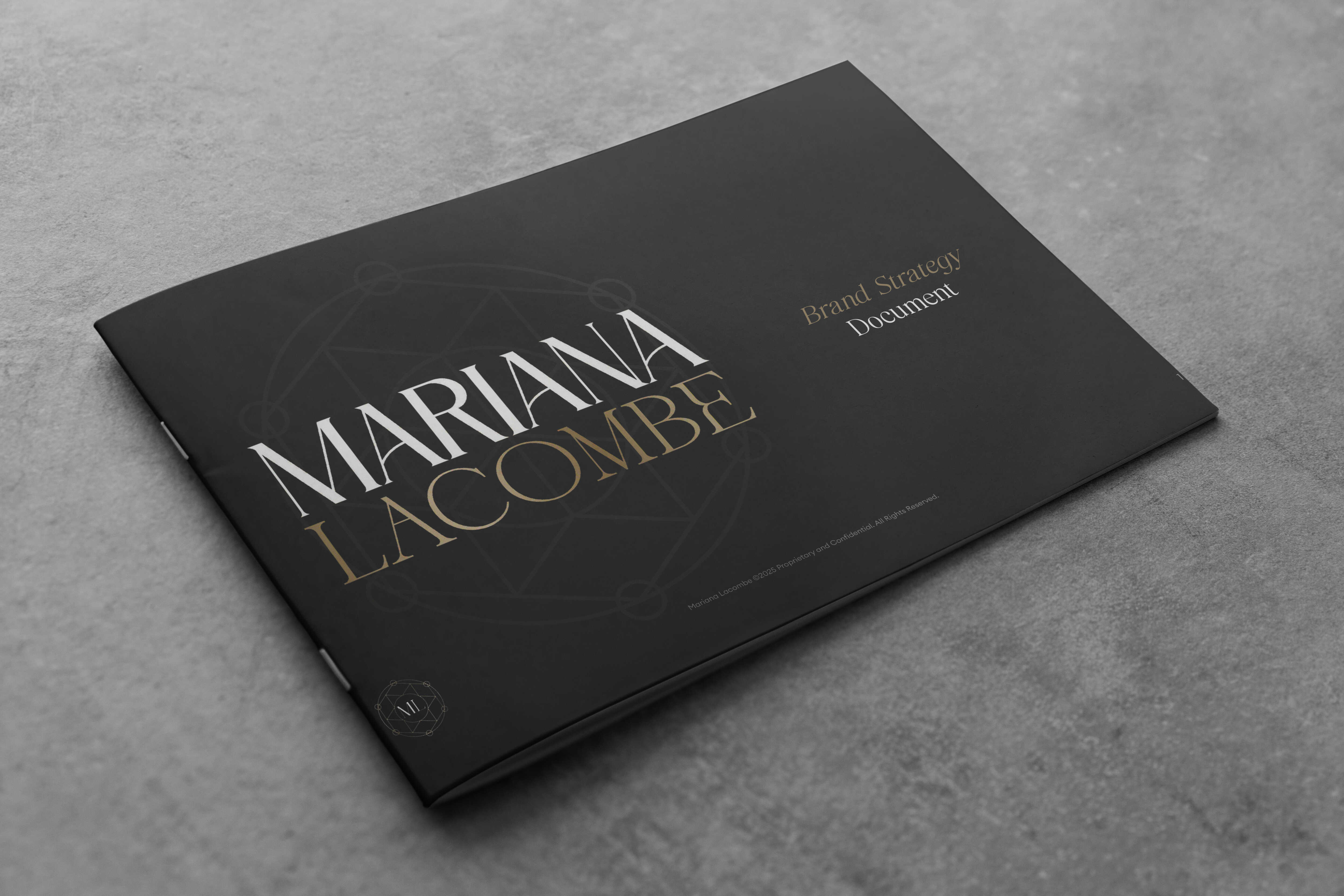
Getting there involved a genuine pivot. The first design direction was fully developed and presented: a darker, more dramatic treatment built on the studio's existing identity, with deep grounds setting off the jewel-toned photography. It was strong work, and through team deliberation it became clear it was not the right work. The darker treatment spoke to where the brand had been rather than where it was going. Rather than defending the first answer, 9 Designs rethought the direction from the ground up, and the final system emerged from that deliberation with the whole team behind it. Design direction was treated as a hypothesis to be tested with the client, not a verdict to be delivered to them.
9 Designs delivered:
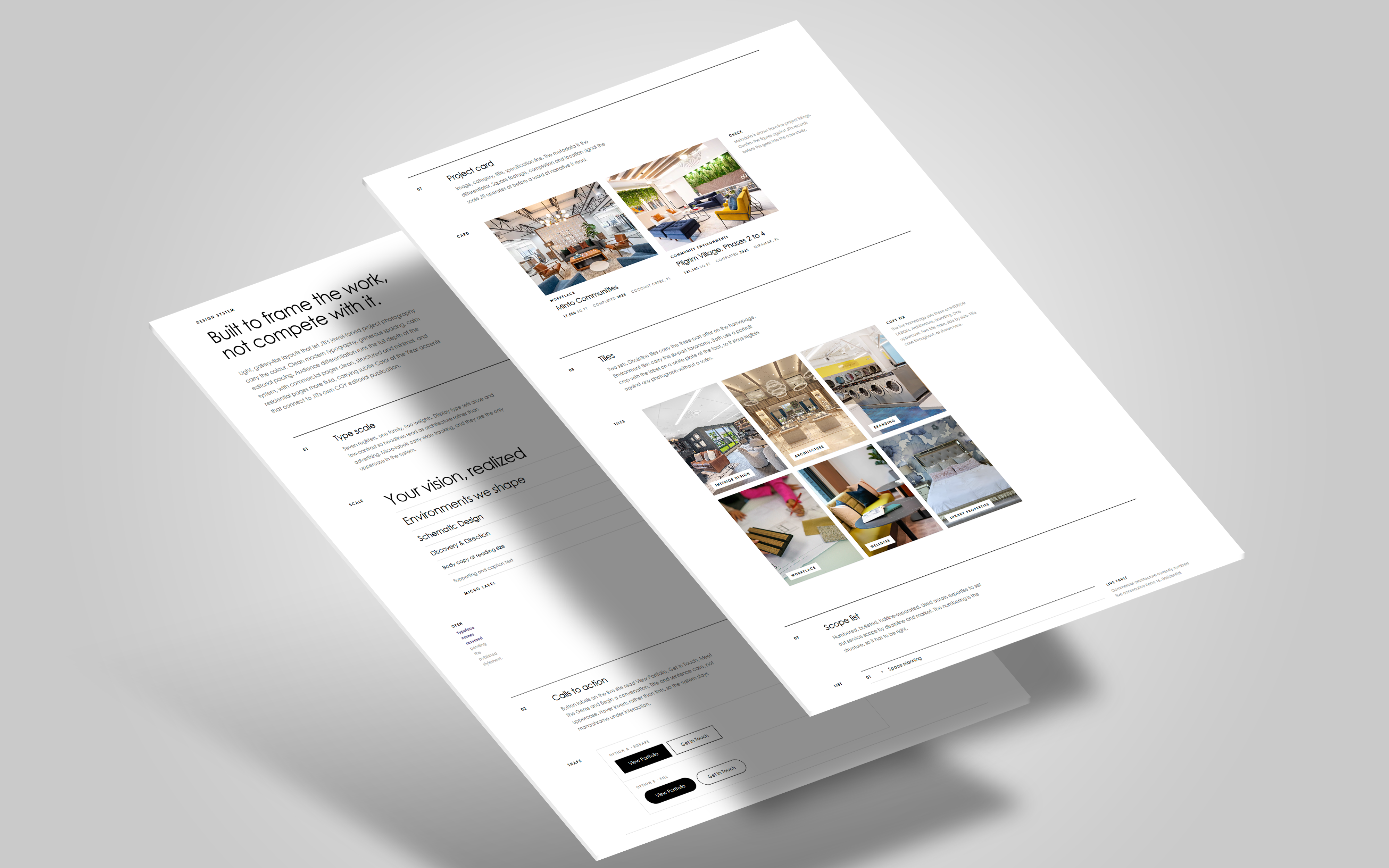
- A complete visual direction and design system covering typography, buttons, forms, grids, hover states, navigation and footer.
- Light, gallery-like layouts that let JTI's jewel-toned project photography provide the colour, framed by clean modern typography and generous spacing.
- Deliberate styling differentiation between audiences: commercial pages clean, structured and minimal; residential pages more fluid, with subtle "Color of the Year" accents connecting to JTI's own COY editorial publication.
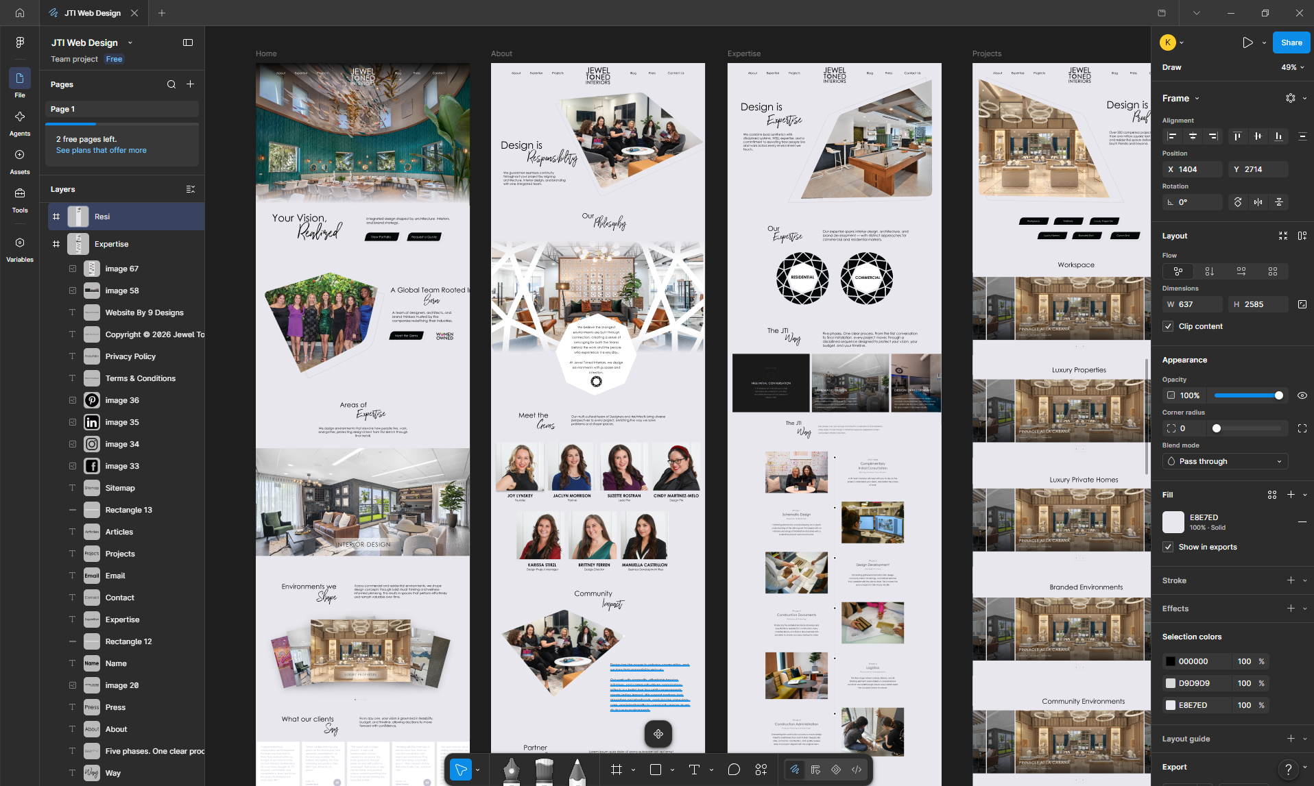
- High-fidelity desktop and mobile UI for every core page, plus global navigation, footer and reusable CTA modules.
- A more distinctive navigation experience WITH varied image sizing, spacing, asymmetric layouts, simple language and calm pacing.
Stage 3 - A bespoke interactive component library
We designed and built a library of custom interactive components as production-ready embeds, prototyped, refined with the client and handed to development. This was one of the most substantial workstreams in the project, and much of it grew beyond the original scope.
The component library included:
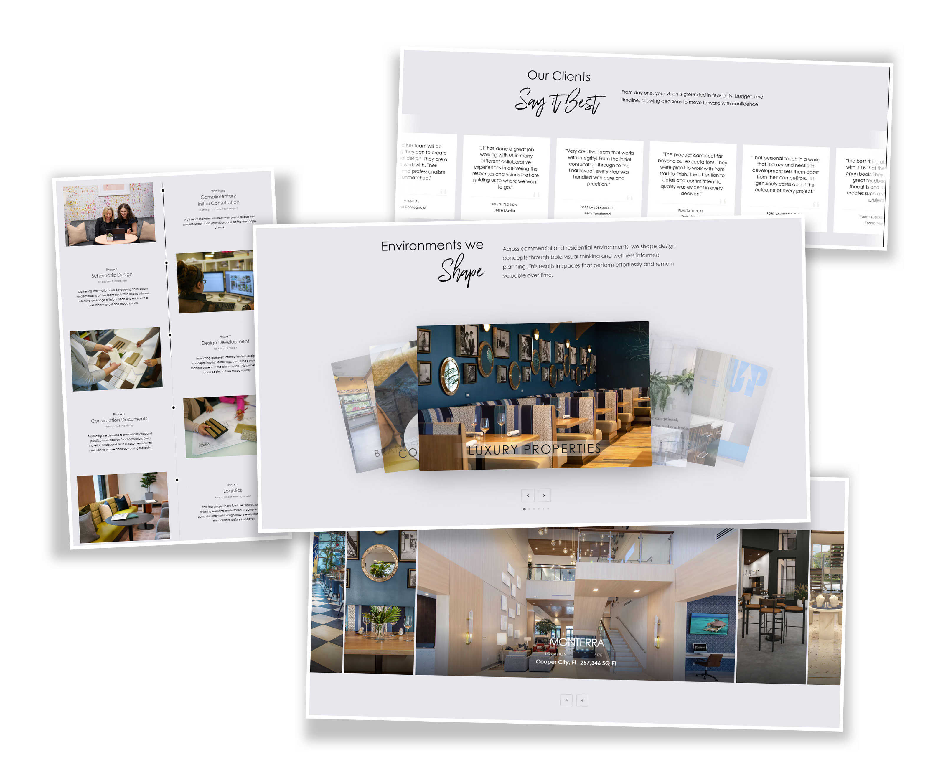
- Flick cards slider. Six landscape cards for JTI's six environment sectors, fully self-contained with drag, swipe, arrow, dot and click navigation.
- Horizontal scroll expertise section. Three full-viewport panels for Interior Design, Architecture and Branding.
- Expertise facets. Rotating gem animations, a nod to the Jewel Toned name, with modal popups matching the team bio style.
- The JTI Way phase slider. A GSAP-powered slider presenting the five project phases with image-backed cards and oversized ghost numerals.
- The JTI Way timeline page. The strategic centrepiece, built to solve the "clients engage us too late" problem: a dual-track diagram mapping JTI's five phases against the client's own project lifecycle with "Engage JTI Here" and "Too Late" markers, a skipped-phases view showing what gets missed, a scroll-through vertical timeline with progress line, a "What Gets Lost" consequences section, and a Full Process versus Piecemeal comparison.
- Cascading projects slider for the portfolio.
- Testimonials scroll marquee with typographic quote watermarks.
- Associations marquee at uniform fixed height for visual consistency.
- Magazine-style blog article templates in two treatments, a contained-image editorial version and a cinematic scroll-animation version.
- Blog strip in a 2x2 image-overlay card layout.
- Black-and-white to colour hover grid of project thumbnails, letting the portfolio literally shift from monochrome into jewel tones on interaction.
- Press and accolades page rebuilt from live site data with editorial layout linking out to articles, award pages, podcasts and YouTube.
- 404 page with offset SVG button styling.
- Terms & Conditions and Privacy Policy pages, both rewritten from scratch because the existing boilerplate was outdated. Out of scope, done anyway, because launching with stale legal pages was not an option.
Every component was iterated with the JTI team through direct feedback rounds and handed to Dan for Webflow implementation with the design tokens documented.
Stage 4 - Migration without losing seven years of search equity
JTI's existing WordPress site at jeweltoned.com held roughly 225 blog posts across 25 archive pages, 45 project pages, and years of accumulated search history. Losing that equity during the migration was not acceptable.
9 Designs delivered a complete migration programme:
- A full crawl of the WordPress blog archive, extracting every post title, URL and publish date.
- A standardised new URL structure, moving mixed root-level and category paths into a clean
/blog/prefix. - Cleanup of legacy URL problems found during the crawl: date-prefixed slugs, slugs that did not match their post titles, and duplicate posts flagged for consolidation.
- A three-tab redirect workbook: migration summary and gotchas, a full post-by-post redirect map, and a clean two-column old-path to new-path sheet formatted for direct import into Webflow's 301 panel.
- 301 redirect implementation for all posts plus category and tag archive pages, planned within Webflow's 500-redirect limit.
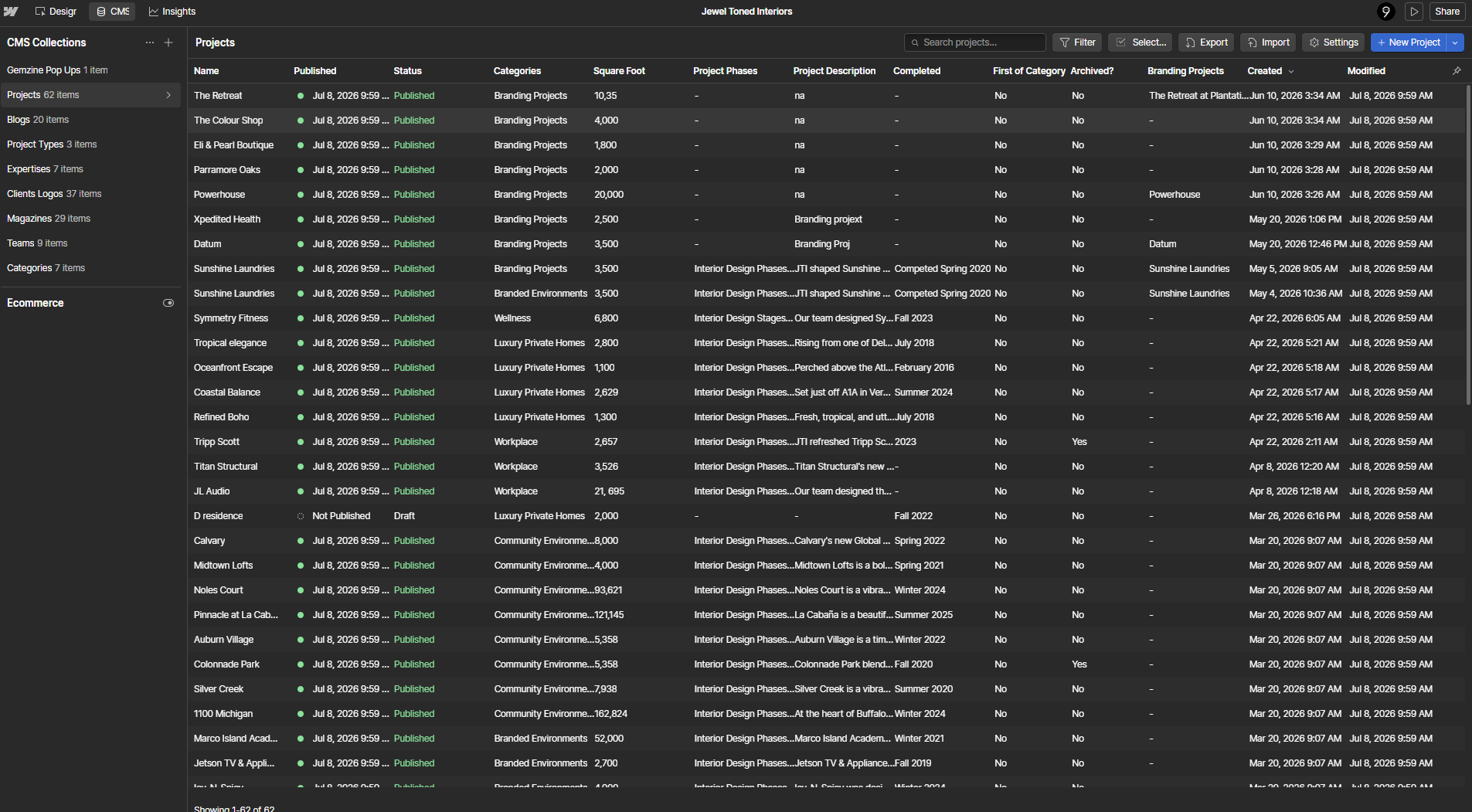
- Webflow CMS import files for blog content with full HTML post bodies, summaries, authors, dates and imagery, covering the team's multiple contributing authors.
- Pre-migration benchmarking guidance so rankings and traffic could be compared after launch, and a post-launch plan covering sitemap resubmission and crawl-error monitoring in Search Console.
- HTML and XML sitemaps for the new site.
.gif)
Stage 5 - Development, CMS and integrations
The site was developed in Webflow with a manageable CMS and reusable components.
The build covered:
- Responsive development across all breakpoints.
- CMS collections enabling the JTI team to add and update projects, press items, blog posts and team bios themselves.
- Home: hero carousel with full-width photography, the WOMEN OWNED mark, Areas of Expertise block, horizontal scrolling vertical blocks for the six environments, and the monochrome-to-colour hover project grid.
- About: full team photo, individual headshots with click-to-expand bios, Community Impact section, association logos, and COY issue volumes linking out to Issuu.
- Expertise: separate commercial and residential sections, competence areas, The JTI Way phases, blog entry points across ten content categories, and testimonials.
- Projects: a vertical dropdown filter across all six environments, a template layout per vertical, and image-heavy detail pages with project name, type, location, tight two-to-three sentence descriptions, renderings and in-progress photos, and an awards module.
- Contact: a two-path system splitting Commercial and Luxury Private Homes, with dynamic form fields and qualifying questions per selection, so qualification happens inside the form itself.
- Lead infrastructure: multiple CTA types (consult requests, downloads, portfolio access, quote requests) integrated with monday.com.
- Footer with newsletter subscription integration.
Stage 6 - Technical SEO, metadata, performance and analytics
The SEO foundation was built into the site rather than bolted on:
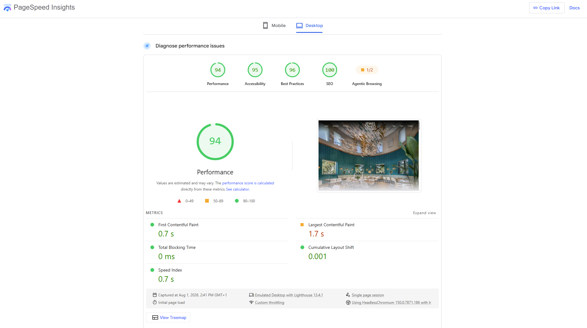
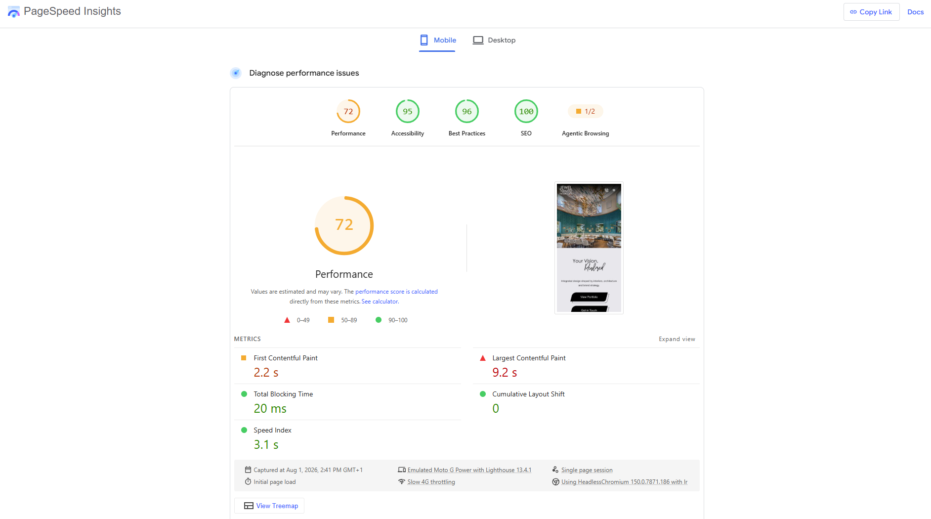
- Technical SEO implementation: metadata, clean URLs, schema markup where applicable, and page performance tuning against Core Web Vitals.
- Keyword research and on-page optimisation for agreed priority pages, targeting high-intent terms such as "interior design Fort Lauderdale" across the Workplace, Luxury Properties and Wellness pages.
- A complete SEO and Open Graph metadata suite written for every page: titles, meta descriptions, OG titles, OG descriptions and social share imagery, all carrying the brand's "Design is..." narrative language.
- Analytics setup with goal and conversion tracking.
- A blog strategy positioning content as a commercial channel: project stories, design insights and industry thought leadership, with approved templates protecting the editorial aesthetic.
A full pre-launch performance and technical audit, combining PageSpeed diagnostics with a manual code review, produced a prioritised, owner-assigned fix list across seven areas:
- Images. AVIF conversion and proper resizing across the portfolio-heavy build, cutting page weight from roughly 25MB towards 3 to 5MB and moving largest-contentful-paint into the good range, with lazy loading below the fold and preloading for hero imagery.
- Scripts. Removal of duplicate GSAP and Finsweet loads and deferral of all non-critical scripts, ten of twelve of which had been render-blocking.
- SEO foundations. Correct H1 structure, canonical tag to the production domain, robots directives, schema URL fixes and LocalBusiness schema for local search visibility, with staging set to noindex before go-live.
- Accessibility. Descriptive alt text across 61 images that were missing it and ARIA labels on every interactive element, moving the site towards WCAG 2.1 AA.
- Fonts. Font-display swap to eliminate invisible text during load.
- Analytics rescue. The audit discovered the old site's Universal Analytics tag had been dead since Google retired the platform in July 2023, meaning the client had unknowingly been without visitor data for nearly three years. The new site launched with GA4 verified and firing, Google Search Console configured and the XML sitemap submitted.
- Pre-launch checklist. Re-tested PageSpeed targets, real-device testing on iOS and Android hardware, form submission and routing checks, and old-site redirection immediately at go-live to avoid duplicate content.
Stage 7 - Review cycles, QA and launch
The build was shaped through more than 15 team calls and successive rounds of review, with well over 300 individual items of feedback captured, logged and owned across the project, and each one worked through to a conclusion rather than waved through. That intensity was never friction. It reflected two teams engaged in the same pursuit, sweating the details from interaction design down to typography and imagery until the site read as luxury calibre on every screen. QA across key browsers, devices and breakpoints was followed by a coordinated go-live, with the domain transitioned from the legacy WordPress site and the JTI team trained and documented to manage the CMS, projects, press and blog themselves. The result of all that iteration is invisible by design: a site that simply feels resolved.

Project Result
The strongest impact was strategic clarity.
JTI now has a website that matches the level of the business and the type of clients it wants to attract. The brand feels more considered online, the user journey is more purposeful, and the site is positioned to support future growth activity.
Final outcomes included:
- A more premium and intentional digital presence.
- Clearer positioning for a high-value design audience across six environment verticals.
- Stronger qualification of potential clients, built into the journey and the forms themselves.
- The JTI Way system that teaches clients when to engage, addressing the firm's most costly sales problem.
- Around 225 blog posts and 45 projects migrated with search equity protected through a complete 301 redirect programme.
- A bespoke interactive component library no template site could replicate.
- Better balance between visual inspiration and commercial clarity.
- Connected lead infrastructure flowing enquiries into monday.com and Mailchimp with segmentation.
- A technical SEO and metadata foundation targeting the searches that matter commercially.
- A live website the JTI team can update themselves, with training and documentation.
- A clearer post-launch roadmap for growth, and a stronger partnership model between JTI and 9 Designs.
The relaunch moved JTI from having a website that presented the business to having a website that actively supports it.
.jpg)
.jpg)
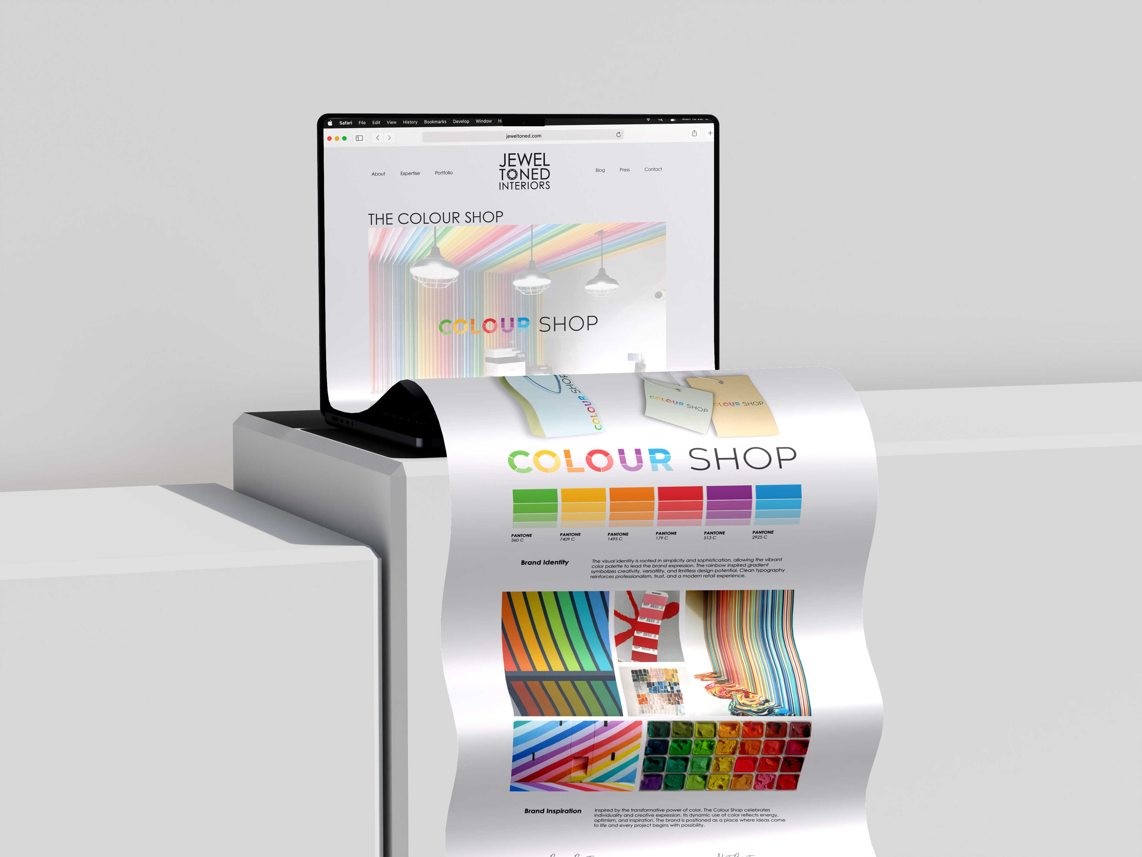
.jpg)
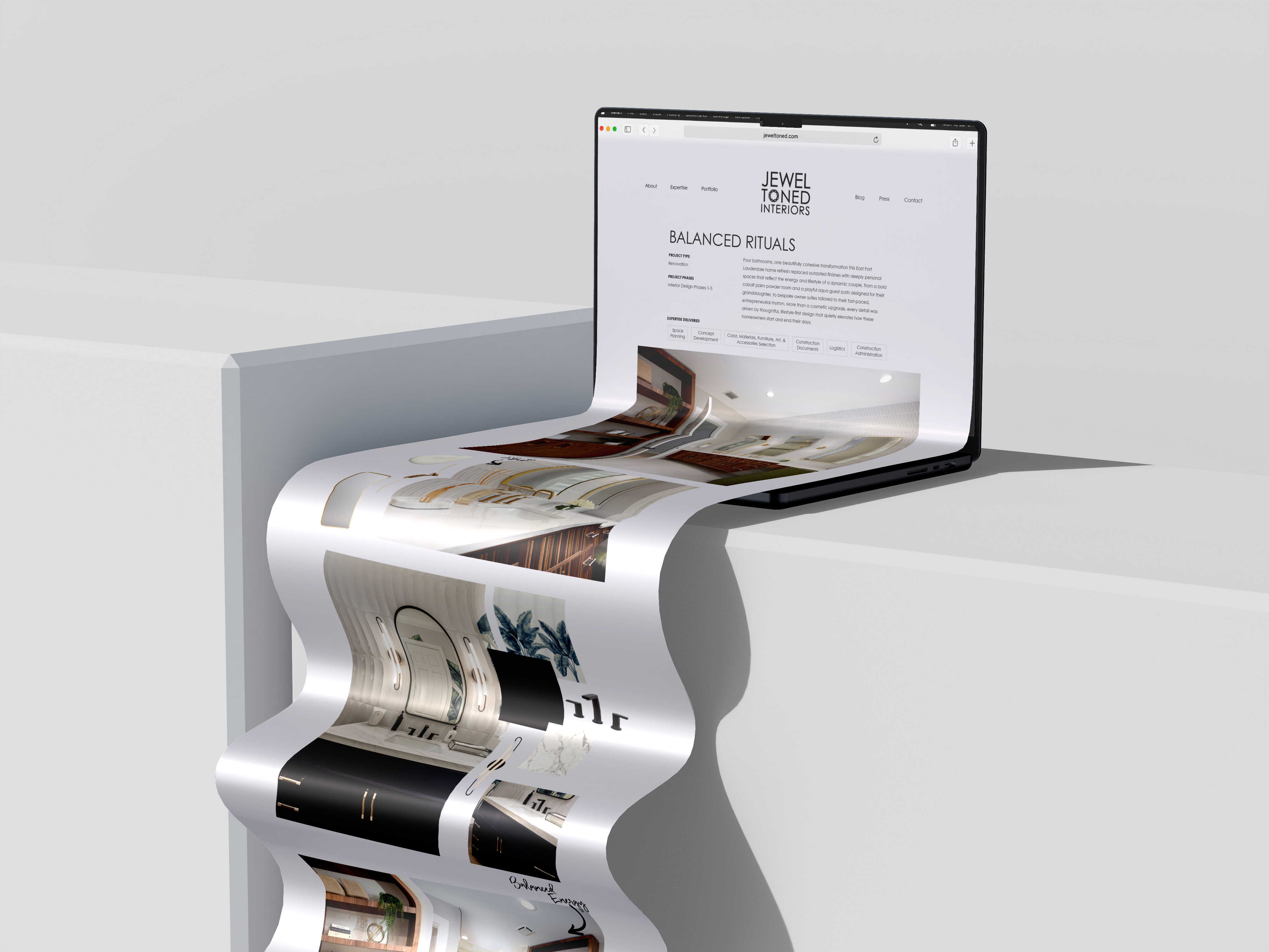
The Live Site
.png)
Posi+ive Impact
The project strengthens a women-owned firm at the moment it is scaling, and gives its community work a permanent digital home. JTI's Community Impact section, association memberships and community environments portfolio, spaces designed for the public good, now sit visibly within the brand rather than at its edges. The migration preserved seven years of the team's design writing and knowledge-sharing, and The JTI Way educates clients openly about how good design processes protect project outcomes, raising the standard of the conversation for the whole category.
more projects
find more impactful case studies below or to view our full project portfolio, click here.
.png)